A passion project where I designed a location based iOS App to improve accessibility to hard-copies of books for millennial and Gen Z book lovers by connecting them with local libraries and bookstores thereby bolstering business opportunities and customer base for the local bookstore community
UX Designer - Tanya Kuruvilla
Design Mentor - Oscar Lemus
Course Instructor - Prof. Andy Hunsucker
User Research, Interaction Design, Visual Design, Motion Design, Wire-framing, Prototyping and Usability Testing
Millennial and Gen Z Book Lovers
Local Libraries and Bookstores
3 months
Figma, Illustrator, After Effects, Miro, Whimsical
Millennial book-lovers enjoy reading out of hard copies of books, but resorted to digital and audio versions due to various limitations.
Local bookstores were not approached by millennials although they had great book collections at cheaper rates than several e-commerce sites.
Hard-copies were costlier
than other formats
Book collections in local bookstores was not known to people.
Millennials could not carry books with them when they moved
Millennials lacked transportation to reach the bookstore.
Bookstores lacked funds to promote themselves
Bookstores could not build a customer base.

The design process consisted broadly of interviews, iterations, design and testing followed by animations. Book-lovers and Bookstore staffs were the target user groups

I conducted remote interviews with both the user groups - Bookstore Staff and Book-lovers.
As a first step, I interviewed 5 library staff to understand the problem space.

Most readers were youngsters within the age group of 20 and 30.
Most of the readers preferred hard-copies of books to digital collections.
Libraries conducted reading campaigns to gain popularity in their community.
Readers were interested in donating their books.
Some libraries home-delivered books to readers.
Once I finalized on my target reader user group, I interviewed 7 college students from Indiana University


As I conducted interviews with the readers, I resorted to affinity diagramming to understand what the common points were and which problem space required focus.
People resort to using E-books to escape the hassle of managing physical books.
Reading habits depend on multiple interrelated factors such as book format. time. interest in the book, author
People's relationship with the book determines what they do with it after reading it.
Even when the next read is chosen, it is hard to find the physical book at a nearby location for a reasonable price.
People enjoy having unique reading experiences with just the right amount of interactions with online platforms, reviewers and friends.


As I mapped the journey of the reader, I noted the feeling of the reader at each step, captured the pain points and discussed the design opportunities.
Since most millennials are tech-savvy, the UX of the app should cater to the target audience.
Usable and clear interactions
Fast and Easy
Youthful and Fresh
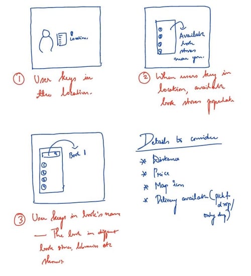
The main idea was to design an app that could locate nearby bookstores and libraries to buy, borrow and donate books.


Online and offline Payments
Some millennials preferred going to the store to pick up books.
Provision to enter library card number
Some people belonged to an institution or had library membership
Provision to apply for library card number
Will be directed to the official bookstore website.
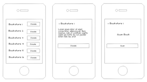
Scanning books for eligibility for donation
Eligibility for donation depended on genre and condition.
Delivery service availability and non-availability
Some people could not afford to use their own transportation and relied on delivery services.
Recommendations of books section
An overkill feature as recommendations was huge space in itself.
Borrowing and donation between individuals -
The app was a way for local bookstores to gain popularity. Bringing in interactions between individuals did not cater to the goal.
The reader can perform 3 main tasks -
1. Buy a book
2. Borrow a book
3. Donate books


Once the task analyses was done, I moved on to understanding the task flows to design the screens. I focused on 2 paths - buy/borrow a book and donate book.
Once the task flows were created, I wire-framed and proto-typed the screens and tested the prototype with 4 students
While testing 'Donating a book' section, I realized how participants wanted to know about the organization they were donating to.
On clicking a bookstore, the user sees a small gist about the bookstore before he chooses to donate.

I noticed how some participants wanted to see reviews and provide reviews for a book.
I added a review section and provided a text area for reviewing a book.

I have focussed on 3 main sequences - Onboarding, Buy/Borrow a book, donate a book


As next steps, I came up with a strategy to get the App to as many people as possible.
My research showed that most millennials in a small city belonged to some institution - either a school, college or university. We could use this to our advantage by cashing in on the number of people who go to these institutions and get the app to as many students/millennials as possible.
Fall in love with the problem space to go the extra mile
This was a problem space that was close to my heart. I moved to the US in 2019 and had trouble getting hold of hard-copies of books. The project pushed me to find a design solution around a problem I faced.
Find workarounds to conduct efficient research remotely
As much as I would have loved to conduct interviews and meet fellow book-lovers in person, I had to make the best of the remote interviews I could afford.
Understand target audience to finalize font-types and color palettes
People feel welcome when products 'speak' their language and undersatand them.
Be gentle with yourself when 'Imposter Syndrome' strikes
Multiple times during the course of the project, I found myself questioning my skills as a designer and I learnt to be gentle with myself
