
A website redesign of an investment management website that was used by clients like Toyota and Mercedes for their financial products. The website was also designed for mobiles adaptively, instead of responsively, as it seemed fitting to the overall design space.
UX Designer - Tanya Kuruvilla
Product Manager
Visual Designer
Engineer
Project Manager
User Research, Interaction Design and Information Architecture, Wireframing, Prototyping, Usability Testing
Bank of New York Mellon
(End User - Mercedes, Toyota)
3 months
Adobe XD, Axure, Adobe Illustrator
Investors complained of excessive time spent on the website to study the performance of their investment product and the poor discoverability of important information


Through heuristic evaluation and studying the interaction flows and placements of alerts, interest rates and Instructions on the website, I discovered the following

Setting and managing custom alerts had a cumbersome and unintuitive interaction flow

Instructions and Interest rate for a particular Note was difficult to find

From interview comments and heuristic evaluation, it was clear that
1. Interest Rate
2. Alerts
3. Instructions
required the most focus


Here’s why - I closely studied what the Investors did on the website and found a pattern.
Investors often used the website to check performance of existing Notes and rarely used the website to create new Notes which had over 200 fields and required a desktop. Investors could easily use the website on mobile phones to quickly check how the performance of Notes


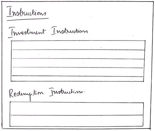
Redesign the Instructions Tab - with separated investment and redemption instructions

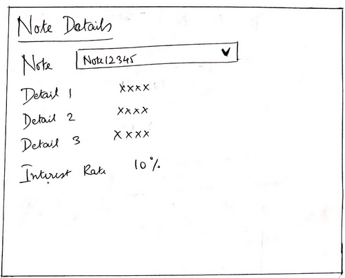
Show interest rate with the Note Details

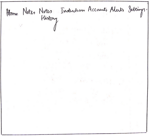
Reduce the number of tabs on the website for cleaner information architecture
But what if I could show all the important details
on the home page of the website.
The investors could have a snapshot of all details
right on the landing page
The Home Page shows the most important details required for the Investors - Interest Rate, Provision to show the Notes History and Instructions

Interest Rate shown as a Note Detail on the Home page
Provision to view Alerts and Instructions from the Home page

Based on usability testing, I chose to change the View Alerts button to View Notes History was a more important task
Most people were used to visualizing bank details on grids instead of cards on desktops. So, I decided to use grids in desktop version and cards in mobile version thus making the website adaptive over responsive.

Too many horizontal tabs
Irrelevant information on each page, poorly utilized real estate.
Bad Information Architecture.

During the feedback session, I understood that applying for Services was undertaken rarely. Hence, I decided to use the space on the right to focus more on the Notes and its related information.

Most investors were used to having 'Notes History' and 'Instructions' as menu items. While the layout was suitable for new investors, removing these menu items from the main tab navigation may handicap existing investors.

1. All important details required for the Investors are handled on the 'Home' page.
2. 'Alerts' and 'Services' are given prominent and important placements.
3. Reasonable number of horizontal tabs.
Alerts page showing inbox alerts, custom alerts and system alerts was optimized for the best interaction pattern

Alerts page showing Inbox alerts, custom alerts and system alerts with Create Alert option on the top right

Setting up Alerts was a separate task within the alerts section and grouping it with the inbox alerts did not hold context. Set up Alerts link on the top right lead to the Custom and System alerts with the provision to Create Alert


Time spent to check Note performance
down by 50%
Metrics showed that the amount of time spent to check the Note performance went down by 50% because of the newly redesigned Homepage.
"I hardly had to spend any time on the website last month. The first page has everything I needed to see"
The homepage redesign was highly appreciated by the Investors
Being the only designer on the project was a different experience
It was extremely challenging to work on the whole project as the only UX Designer.
Is geographical distance really a problem?
I may have had more control over the interview sessions if I could interact with Investors in NY
Information Architecture is everything!
By just redesigning information on the website, its possible to give a complete facelift to the product.

Interview comments to understand
important features used by Investors
Investors complained of important features not being easily discoverable on the website. As a first step, I had to understand what were the important features that Investors were referring to. The interview comments were collected from different investors and sent to me.
My goal was to curate all the comments and identify common patterns and pain points
Alerts, Interest Rates and Instructions played the major roles in the website-investor interaction